This blog is a companion to my recent book, Exploring Data in Engineering, the Sciences, and Medicine, published by Oxford University Press. The blog expands on topics discussed in the book, and the content is heavily example-based, making extensive use of the open-source statistical software package R.

Tuesday, August 6, 2013

Assessing the precision of classification tree model predictions

My last post focused on the use of the ctree procedure in the R package party to build classification tree models.  These models map each record in a dataset into one of M mutually exclusive groups, which are characterized by their average response.  For responses coded as 0 or 1, this average may be regarded as an estimate of the probability that a record in the group exhibits a “positive response.”  This interpretation leads to the idea discussed here, which is to replace this estimate with the size-corrected probability estimate I discussed in my previous post (Screening for predictive characteristics).  Also, as discussed in that post, these estimates provide the basis for confidence intervals that quantify their precision, particularly for small groups.

In this post, the basis for these estimates is the R package PropCIs, which includes several procedures for estimating binomial probabilities and their confidence intervals, including an implementation of the method discussed in my previous post.  Specifically, the procedure used here is addz2ci, discussed in Chapter 9 of Exploring Data in Engineering, the Sciences, and Medicine.  As noted in both that discussion and in my previous post, this estimator is described in a paper by Brown, Cai and DasGupta in 2002, but the documentation for the PropCIs package cites an earlier paper by Agresti and Coull (“Approximate is better than exact for interval estimation of binomial proportions,” in The American Statistician, vol. 52, 1998, pp. 119-126).  The essential idea is to modify the classical estimator, augmenting the counts of 0’s and 1’s in the data by z2/2, where z is the normal z-score associated with the significance level.  As a specific example, z is approximately 1.96 for 95% confidence limits, so this modification adds approximately 2 to each count.  In cases where both of these counts are large, this correction has negligible effect, so the size-corrected estimates and their corresponding confidence intervals are essentially identical with the classical results.  In cases where either the sample is small or one of the possible responses is rare, these size-corrected results are much more reasonable than the classical results, which motivated their use both here and in my earlier post.


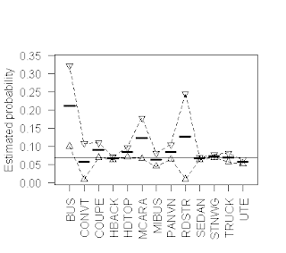
The above plot provides a simple illustration of the results that can be obtained using the addz2ci procedure, in a case where some groups are small enough for these size-corrections to matter.  More specifically, this plot is based on the Australian vehicle insurance dataset that I discussed in my last post, and it characterizes the probability that a policy files a claim (i.e., that the variable clm has the value 1), for each of the 13 vehicle types included in the dataset.  The heavy horizontal line segments in this plot represent the size-corrected claim probability estimates for each vehicle type, while the open triangles connected by dotted lines represent the upper and lower 95% confidence limits around these probability estimates, computed as described above.  The solid horizontal line represents the overall claim probability for the dataset, to serve as a reference value for the individual subset results.

An important observation here is that although this dataset is reasonably large (there are a total of 67,856 records), the subgroups are quite heterogeneous in size, spanning the range from 27 records listing “RDSTR” as the vehicle type to 22,233 listing “SEDAN”.  As a consequence, although the classical and size-adjusted claim probability estimates and their confidence intervals are essentially identical for the dataset overall, the extent of this agreement varies substantially across the different vehicle types.  Taking the extremes, the results for the largest group (“SEDAN”) are, as with the dataset overall, almost identical: the classical estimate is 0.0665, while the size-adjusted estimate is 0.0664; the lower 95% confidence limit also differs by one in the fourth decimal place (classical 0.0631 versus size-corrected 0.0632), and the upper limit is identical to four decimal places, at 0.0697.  In marked contrast, the classical and size-corrected estimates for the “RDSTR” group are 0.0741 versus 0.1271, the upper 95% confidence limits are 0.1729 versus 0.2447, and the lower confidence limits are -0.0247 versus 0.0096.  Note that in this case, the lower classical confidence limit violates the requirement that probabilities must be positive, something that is not possible for the addz2ci confidence limits (specifically, negative values are less likely to arise, as in this example, and if they ever do arise, they are replaced with zero, the smallest feasible value for the lower confidence limit; similarly for upper confidence limits that exceed 1).  As is often the case, the primary advantage of plotting these results is that it gives us a much more immediate indication of the relative precision of the probability estimates, particularly in cases like “RDSTR” where these confidence intervals are quite wide.

The R code used to generate these results uses both the addz2ci procedure from the PropCIs package, and the summaryBy procedure from the doBy package.  Specifically, the following function returns a dataframe with one row for each distinct value of the variable GroupingVar.  The columns of this dataframe include this value, the total number of records listing this value, the number of these records for which the binary response variable BinVar is equal to 1, the lower confidence limit, the upper confidence limit, and the size-corrected estimate.  The function is called with BinVar, GroupingVar, and the significance level, with a default of 95%.  The first two lines of the function require the doBy and PropCIs packages.  The third line constructs an internal dataframe, passed to the summaryBy function in the doBy package, which applies the length and sum functions to the subset of BinVar values defined by each level of GroupingVar, giving the total number of records and the total number of records with BinVar = 1.  The main loop in this program applies the addz2ci function to these two numbers, for each value of GroupingVar, which returns a two-element list.  The element $estimate gives the size-corrected probability estimate, and the element $conf.int is a vector of length 2 with the lower and upper confidence limits for this estimate.  The rest of the program appends these values to the internal dataframe created by the summaryBy function, which is returned as the final result.  The code listing follows:

BinomialCIbyGroupFunction <- function(BinVar, GroupingVar, SigLevel = 0.95){
  #
  require(doBy)
  require(PropCIs)
  #
  IntFrame = data.frame(b = BinVar, g = as.factor(GroupingVar))
  SumFrame = summaryBy(b ~ g, data = IntFrame, FUN=c(length,sum))
  #
  n = nrow(SumFrame)
  EstVec = vector("numeric",n)
  LowVec = vector("numeric",n)
  UpVec = vector("numeric",n)
  for (i in 1:n){
    Rslt = addz2ci(x = SumFrame$b.sum[i],n = SumFrame$b.length[i],conf.level=SigLevel)
    EstVec[i] = Rslt$estimate
    CI = Rslt$conf.int
    LowVec[i] = CI[1]
    UpVec[i] = CI[2]
  }
  SumFrame$LowerCI = LowVec
  SumFrame$UpperCI = UpVec
  SumFrame$Estimate = EstVec
  return(SumFrame)
}


 The binary response characterization tools just described can be applied to the results obtained from a classification tree model.  Specifically, since a classification tree assigns every record to a unique terminal node, we can characterize the response across these nodes, treating the node numbers as the data groups, analogous to the vehicle body types in the previous example.  As a specific illustration, the figure above gives a graphical representation of the ctree model considered in my previous post, built using the ctree command from the party package with the following formula:

            Fmla = clm ~ veh_value + veh_body + veh_age + gender + area + agecat

Recall that this formula specifies we want a classification tree that predicts the binary claim indicator clm from the six variables on the right-hand side of the tilde, separated by “+” signs.  Each of the terminal nodes in the resulting ctree model is characterized with a rectangular box in the above figure, giving the number of records in each group (n) and the average positive response (y), corresponding to the classical claim probability estimate.  Note that the product ny corresponds to the total number of claims in each group, so these products and the group sizes together provide all of the information we need to compute the size-corrected claim probability estimates and their confidence limits for each terminal node.  Alternatively, we can use the where method associated with the binary tree object that ctree returns to extract the terminal nodes associated with each observation.  Then, we simply use the terminal node in place of vehicle body type in exactly the same analysis as before.


The above figure shows these estimates, in the same format as the original plot of claim probability broken down by vehicle body type given earlier.  Here, the range of confidence interval widths is much less extreme than before, but it is still clearly evident: the largest group (Node 10, with 23,315 records) exhibits the narrowest confidence interval, while the smallest groups (Node 9, with 1,361 records, and Node 13, with 1,932 records) exhibit the widest confidence intervals.  Despite its small size, however, the smallest group does exhibit a significantly lower claim probability than any of the other groups defined by this classification tree model.

The primary point of this post has been to demonstrate that binomial confidence intervals can be used to help interpret and explain classification tree results, especially when displayed graphically as in the above figure.  These displays provide a useful basis for comparing classification tree models obtained in different ways (e.g., by different algorithms like rpart and ctree, or by different tuning parameters for one specific algorithm).  Comparisons of this sort will form the basis for my next post.
Saturday, April 13, 2013

Classification Tree Models

On March 26, I attended the Connecticut R Meetup in New Haven, which featured a talk by Illya Mowerman on decision trees in R.  I have gone to these Meetups before, and I have always found them to be interesting and informative.  Attendees range from those who are just starting to explore R to those who have multiple CRAN packages to their credit.  Each session is organized around a talk that focuses on some aspect of R and both the talks and the discussion that follow are typically lively and useful.  More information about the Connecticut R Meetup can be found here, and information about R Meetups in other areas can be found with a Google search on “R Meetup” with a location.


Mowerman’s talk focused on decision trees like the one shown in the figure above.  I give a somewhat more detailed discussion of this example below, but the basic idea is that the tree assigns every record in a dataset to a unique group, and a predicted response is generated for each group.  The basic decision tree models are either classification trees, appropriate to binary response variables, or regression tree models, appropriate to numeric response variables.  The figure above represents a classification tree model that predicts the probability that an automobile insurance policyholder will file a claim, based on a publicly available insurance dataset discussed further below.  Two advantages of classification tree models that Mowerman emphasized in his talk are, first, their simplicity of interpretation, and second, their ability to generate predictions from a mix of numerical and categorical covariates.  The above example illustrates both of these points – the decision tree is based on both categorical variables like veh_body (vehicle body type) and numerical variables like veh_value (the vehicle value in units of 10,000 Australian dollars). 

To interpret this tree, begin by reading from the top down, with the root node, numbered 1, which partitions the dataset into two subsets based on the variable agecat.  This variable is an integer-coded driver age group with six levels, ranging from 1 for the youngest drivers to 6 for the oldest drivers.  The root node splits the dataset into a younger driver subgroup (to the left, with agecat values 1 through 4) and an older driver subgroup (to the right, with agecat values 5 and 6).  Going to the right, node 11 splits the older driver group on the basis of vehicle value, with node 12 consisting of older drivers with veh_value less than or equal to 2.89, corresponding to vehicle values not more than 28,900 Australian dollars.  This subgroup contains 15,351 policy records, of which 5.3% file claims.  Similarly, node 13 corresponds to older drivers with vehicles valued more than 28,900 Australian dollars; this is a smaller group (1,932 policy records) with a higher fraction filing claims (8.3%).  Going to the left, we partition the younger driver group first on vehicle body type (node 2), then possibly a second time on driver age (node 4), possibly further on vehicle value (node 6) and finally again on vehicle body type (node 7).  The key point is that every record in the dataset is ultimately assigned to one of the seven terminal nodes of this tree (the “leaves,” numbered 3, 5, 8, 9, 10, 12, and 13).  The numbers associated with these nodes gives their size and the fraction of each group that files a claim, which may be viewed as an estimate of the conditional probability that a driver from each group will file a claim. 

Classification trees can be fit to data using a number of different algorithms, several of which are included in various R packages.  Mowerman’s talk focused primarily on the rpart package that is part of the standard R distribution and includes a procedure also named rpart, based on what is probably the best known algorithm for fitting classification and regression trees.  In addition, Mowerman also discussed the rpart.plot package, a very useful adjunct to rpart that provides a lot of flexibility in representing the resulting tree models graphically.  In particular, this package can be used to make much nicer plots than the one shown above; I haven't done that here largely because I have used a different tree fitting procedure, for reasons discussed in the next paragraph.  Another classification package that Mowerman mentioned in his talk is C50, which implements the C5.0 algorithm popular in the machine learning community.  The primary focus of this post is the ctree procedure in the party package, which was used to fit the tree shown here.

The reason I have used the ctree procedure instead of the rpart procedure is that for the dataset I consider here, the rpart procedure returns a trivial tree.  That is, when I attempt to fit a tree to the dataset using rpart with the response variable and covariates described below, the resulting “tree” assigns the entire dataset to a single node, declaring the overall fraction of positive responses in the dataset to be the common prediction for all records.  Applying the ctree procedure (the code is listed below) yields the nontrivial tree shown in the plot above.  The reason for the difference in these results is that the rpart and ctree procedures use different tree-fitting algorithms.  Very likely, the reason rpart has such difficulty with this dataset is its high degree of class imbalance: the positive response (i.e., “policy filed one or more claims”) occurs in only 4,264 of 67,856 data records, representing 6.81% of the total.  This imbalance problem is known to make classification difficult, enough so that it has become the focus of a specialized technical literature.  For a rather technical survey of this topic, refer to the paper “The Class Imbalance Problem: A Systematic Study,” by Japkowicz and Stephen (Intelligent Data Analysis, volume 6, number 5, November, 2002).  (So far, I have not been able to find a free version of this paper, but if you are interested in the topic, a search on this title turns up a number of other useful papers on the topic, although generally more specialized than this broad survey.)

To obtain the tree shown in the plot above, I used the following R commands:

> library(party)
> carFrame = read.csv("car.csv")
> Fmla = clm ~ veh_value + veh_body + veh_age + gender + area + agecat
> TreeModel = ctree(Fmla, data = carFrame)
> plot(TreeModel, type="simple")


The first line loads the party package to make the ctree procedure available for our use, and the second line reads the data file described below into the dataframe carFrame (note that this assumes the data file "car.csv" has been loaded into R's current working directory, which can be shown using the getwd() command).  The third line defines the formula that specifies the response as the binary variable clm (on the left side of "~") and the six other variables listed above as potential predictors, each separated by the "+" symbol.  The fourth line invokes the ctree procedure to fit the model and the last line displays the results.

The dataset I used here is car.csv, available from the website associated with the book Generalized Linear Models for Insurance Data, by Piet de Jong and Gillian Z. Heller.  As noted, this dataset contains 67,856 records, each characterizing an automobile insurance policy associated with one vehicle and one driver.  The dataset has 10 columns, each representing an observed value for a policy characteristic, including claim and loss information, vehicle characteristics, driver characteristics, and certain other variables (e.g., a categorical variable characterizing the type of region where the vehicle is driven).  The ctree model shown above was built to predict the binary response variable clm (where clm = 1 if one or more claims have been filed by the policyholder, and 0 otherwise), based on the following prediction variables:


-         the numeric variable veh_value;
-         veh_body, a categorical variable with 13 levels;
-         veh_age, an integer-coded categorical variable with 4 levels;
-         gender, a binary indicator of driver gender;
-         area, a categorical variable with six levels;
-         agecat, and integer-coded driver age variable.

The tree model shown above illustrates one of the points Mowerman made in his talk, that classification tree models can easily handle mixed covariate types: here, these covariates include one numeric variable (veh_value), one binary variable (gender), and four categorical variables.  In principle, tree models can be built using categorical variables with an arbitrary number of levels, but in practice procedures like ctree will fail if the number of levels becomes too large.

One of the tuning parameters in tree-fitting procedures like rpart and ctree is the minimum node size.  In his R Meetup talk, Mowerman showed that increasing this value from the default limit of 7 yielded simpler trees for the dataset he considered (the churn dataset from the C50 package).  Specifically, increasing the minimum node size parameter eliminated very small nodes from the tree, nodes whose practical utility was questionable due to their small size.  In my next post, I will show how a graphical tool for displaying binomial probability confidence limits can be used to help interpret classification tree results by explicitly displaying the prediction uncertainties.  The tool I use is GroupedBinomialPlot, one of those included in the ExploringData package that I am developing.

Finally, I should say in response to a question about my last post that, sadly, I do not yet have a beta test version of the ExploringData package.

Saturday, February 16, 2013

Finding outliers in numerical data

One of the topics emphasized in Exploring Data in Engineering, the Sciences and Medicine is the damage outliers can do to traditional data characterizations.  Consequently, one of the procedures to be included in the ExploringData package is FindOutliers, described in this post.  Given a vector of numeric values, this procedure supports four different methods for identifying possible outliers.

Before describing these methods, it is important to emphasize two points.  First, the detection of outliers in a sequence of numbers can be approached as a mathematical problem, but the interpretation of these data observations cannot.  That is, mathematical outlier detection procedures implement various rules for identifying points that appear to be anomalous with respect to the nominal behavior of the data, but they cannot explain why these points appear to be anomalous.  The second point is closely related to the first: one possible source of outliers in a data sequence is gross measurement errors or other data quality problems, but other sources of outliers are also possible so it is important to keep an open mind.  The terms “outlier” and “bad data” are not synonymous.  Chapter 7 of Exploring Data briefly describes two examples of outliers whose detection and interpretation led to a Nobel Prize and to a major new industrial product (Teflon, a registered trademark of the DuPont Company).

In the case of a single sequence of numbers, the typical approach to outlier detection is to first determine upper and lower limits on the nominal range of data variation, and then declare any point falling outside this range to be an outlier.  The FindOutliers procedure implements the following methods of computing the upper and lower limits of the nominal data range:

1.                  The ESD identifier, more commonly known as the “three-sigma edit rule,” well known but unreliable;
2.                  The Hampel identifier, a more reliable procedure based on the median and the MADM scale estimate;
3.                  The standard boxplot rule, based on the upper and lower quartiles of the data distribution;
4.                  An adjusted boxplot rule, based on the upper and lower quartiles, along with a robust skewness estimator called the medcouple.

The rest of this post briefly describes these four outlier detection rules and illustrates their application to two real data examples.

Without question, the most popular outlier detection rule is the ESD identifier (an abbreviation for “extreme Studentized deviation”), which declares any point more than t standard deviations from the mean to be an outlier, where the threshold value t is most commonly taken to be 3.  In other words, the nominal range used by this outlier detection procedure is the closed interval:

            [mean – t * SD, mean + t * SD]

where SD is the estimated standard deviation of the data sequence.  Motivation for the threshold choice t = 3 comes from the fact that for normally-distributed data, the probability of observing a value more than three standard deviations from the mean is only about 0.3%.  The problem with this outlier detection procedure is that both the mean and the standard deviation are themselves extremely sensitive to the presence of outliers in the data.  As a consequence, this procedure is likely to miss outliers that are present in the data.  In fact, it can be shown that for a contamination level greater than 10%, this rule fails completely, detecting no outliers at all, no matter how extreme they are (for details, see the discussion in Sec. 3.2.1 of Mining Imperfect Data).

The default option for the FindOutliers procedure is the Hampel identifier, which replaces the mean with the median and the standard deviation with the MAD (or MADM)  scale estimate.  The nominal data range for this outlier detection procedure is:

            [median – t * MAD, median + t * MAD]

As I have discussed in previous posts, the median and the MAD scale are much more resistant to the influence of outliers than the mean and standard deviation.  As a consequence, the Hampel identifier is generally more effective than the ESD identifier, although the Hampel identifier can be too aggressive, declaring too many points as outliers.  For detailed comparisons of the ESD and Hampel identifiers, refer to Sec. 7.5 of Exploring Data or Sec. 3.3 of Mining Imperfect Data.

The third method option for the FindOutliers procedure is the standard boxplot rule, based on the following nominal data range:

            [Q1 – c * IQD, Q3 + c * IQD]

where Q1 and Q3 represent the lower and upper quartiles, respectively, of the data distribution, and IQD = Q3 – Q1 is the interquartile distance, a measure of the spread of the data similar to the standard deviation.  The threshold parameter c is analogous to t in the first two outlier detection rules, and the value most commonly used in this outlier detection rule is c = 1.5.  This outlier detection rule is much less sensitive to the presence of outliers than the ESD identifier, but more sensitive than the Hampel identifier, and, like the Hampel identifier, it can be somewhat too aggressive, declaring nominal data observations to be outliers.  An advantage of the boxplot rule over these two alternatives is that, because it does not depend on an estimate of the “center” of the data (e.g., the mean in the ESD identifier or the median in the Hampel identifier), it is better suited to distributions that are moderately asymmetric.

The fourth method option is an extension of the standard boxplot rule, developed for data distributions that may be strongly asymmetric.  Basically, this procedure modifies the threshold parameter c by an amount that depends on the asymmetry of the distribution, modifying the upper threshold and the lower threshold differently.  Because the standard moment-based skewness estimator is extremely outlier-sensitive (for an illustration of this point, see the discussion in Sec. 7.1.1 of Exploring Data), it is necessary to use an outlier-resistant alternative to assess distributional asymmetry.  The asymmetry measure used here is the medcouple, a robust skewness measure available in the robustbase package in R and that I have discussed in a previous post (Boxplots and Beyond - Part II: Asymmetry ).   An important point about the medcouple is that it can be either positive or negative, depending on the direction of the distributional asymmetry; positive values arise more frequently in practice, but negative values can occur and the sign of the medcouple influences the definition of the asymmetric boxplot rule.  Specifically, for positive values of the medcouple MC, the adjusted boxplot rule’s nominal data range is:

            [Q1 – c * exp(a * MC) * IQD, Q3 + c * exp(b * MC) * IQD ]

while for negative medcouple values, the nominal data range is:

            [Q1 – c * exp(-b * MC) * IQD, Q3 + c * exp(-a * MC) * IQD ]

An important observation here is that for symmetric data distributions, MC should be zero, reducing the adjusted boxplot rule to the standard boxplot rule described above.  As in the standard boxplot rule, the threshold parameter is typically taken as c = 1.5, while the other two parameters are typically taken as a = -4 and b = 3.  In particular, these are the default values for the procedure adjboxStats in the robustbase package.


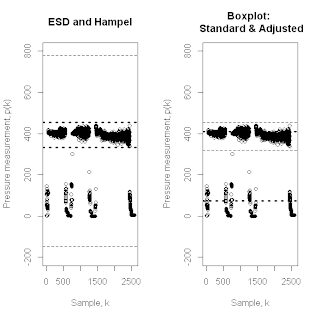
To illustrate how these outlier detection methods compare, the above pair of plots shows the results of applying all four of them to the makeup flow rate dataset discussed in Exploring Data (Sec. 7.1.2) in connection with the failure of the ESD identifier.  The points in these plots represent approximately 2,500 regularly sampled flow rate measurements from an industrial manufacturing process.  These measurements were taken over a long enough period of time to contain both periods of regular process operation – during which the measurements fluctuate around a value of approximately 400 – and periods when the process was shut down, was being shut down, or was being restarted, during which the measurements exhibit values near zero.  If we wish to characterize normal process operation, these shut down episodes represent outliers, and they correspond to about 20% of the data.  The left-hand plot shows the outlier detection limits for the ESD identifier (lighter, dashed lines) and the Hampel identifier (darker, dotted lines).  As discussed in Exploring Data, the ESD limits are wide enough that they do not detect any outliers in this data sequence, while the Hampel identifier nicely separates the data into normal operating data and outliers that correspond to the shut down episodes.  The right-hand plot shows the analogous results obtained with the standard boxplot method (lighter, dashed lines) and the adjusted boxplot method (darker, dotted lines).  Here, the standard boxplot rule gives results very similar to the Hampel identifier, again nicely separating the dataset into normal operating data and shut down episodes.  Unfortunately, the adjusted boxplot rule does not perform very well here, placing its lower nominal data limit in about the middle of the shut down data and its upper nominal data limit in about the middle of the normal operating data.  The likely cause of this behavior is that the relatively large fraction of lower tail outliers, which introduces a fairly strong negative skewness (the medcouple value for this example is -0.589).


The second example considered here is the industrial pressure data sequence shown in the above figure, in the same format as the previous figure.  This data sequence was discussed in Exploring Data (pp. 326-327) as a troublesome case because the two smallest values in this data sequence – near the right-hand end of the plots – appear to be downward outliers in a sequence with generally positive skewness (here, the medcouple value is 0.162).  As a consequence, neither the ESD identifier nor the Hampel identifier give fully satisfactory performance, in both cases declaring only one of these points as a downward outlier and arguably detecting too many upward outliers.  In fact, because the Hampel identifier is more aggressive here, it actually declares more upward outliers, making its performance worse for this example.  The right-hand plot in the above figure shows the outlier detection limits for the standard boxplot rule (lighter, dashed lines) and the adjusted boxplot rule (darker, dotted lines).  As in the previous example, the limits for the standard boxplot rule are almost the same as those for the Hampel identifier (the darker, dotted lines in the left-hand plot), but here the adjusted boxplot rule gives much better results, identifying both of the visually evident downward outliers and declaring far fewer points as upward outliers.

The primary point of this post has been to describe and demonstrate the outlier detection methods to be included in the FindOutliers procedure in the forthcoming ExploringData R package.  It should be clear from these results that, when it comes to outlier detection, “one size does not fit all” – method matters, and the choice of method requires a comparison of the results obtained by each one.  I have not included the code for the FindOutliers procedure here, but that will be the subject of my next post.